
Multi-page Book

The goal of this project was to design a cohesive and thoughtful layout in indesign using an article written by Susan Merritt about the design duo Nancy Skolos and Tom Wedell. Using typography knowledge accumulated in class, I created subheads, used quotes, and designed graphic elements to format a homogenous design for a multi-page book.
Sketches
In order to refine my design system, I developed a variety of sketches to determine the most cohesive layout. I placed particular emphasis on defining focal points by strategically incorporating a distinct color palette and curated graphic elements. By thoughtfully integrating these components, I aimed to create a visually engaging and functional design that effectively communicates the intended message while maintaining aesthetic consistency.


Explorations
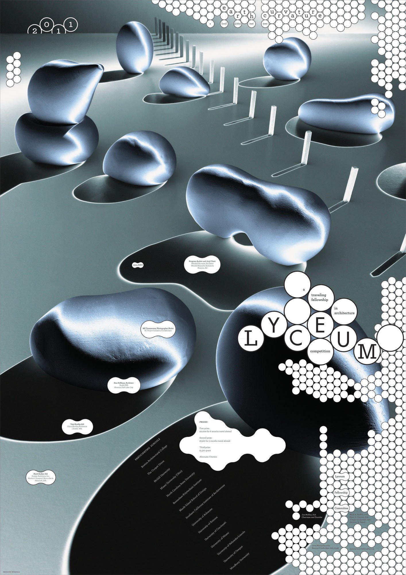
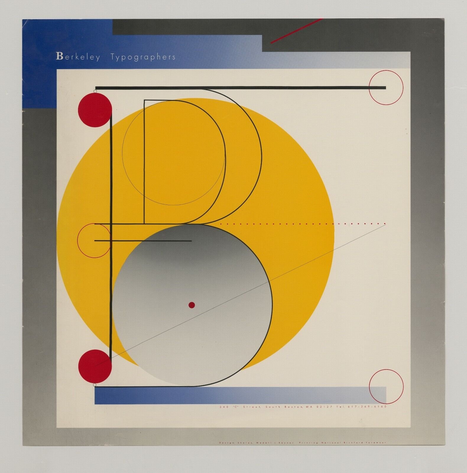
These exploratory layouts are based on the design work of Skolos and Wedell, specifically their 2011 Lyceum Fellowship Poster and 1986 Berkeley Typographers Poster. By carefully analyzing their compositions, I sought to integrate key design elements such as bold geometric forms, layered typography, dynamic spatial relationships as well as incorporating the poster itself into the design.


The typographic and color system I selected to present Skolos and Wedell’s interview was directly inspired by a poster they designed for Kloss Video Corporation. This design features a refined palette consisting of primary colors, plus black and white, which I incorporated to maintain visual coherence and reinforce the bold yet minimalistic aesthetic characteristic of their work. By adopting this restrained color scheme, I aimed to highlight the essence of their design approach while ensuring clarity and cohesion throughout the composition.


